Between the pre-season tests in Barcelona and Sakhir and the Australian Grand Prix free practice getting under way — despite all the recent turmoil — we’ve had plenty of time to get acquainted with this year’s Formula One liveries. Naturally, as it is a topic on which I could ramble on for hours, I figured I’d give my take on each of them.
With the new year came new regulations — including, thankfully, a pushback against the boring bare carbon weight-saving tendencies of yesteryear — alongside a couple of major team realignments and, hooray, our first completely new constructor in a decade in the shape of Cadillac!
All this left me full of optimism, certain we would be set for the most colourful grid since 2016 or 2017…
…except, in practice, it didn’t quite work out like that. There are still lots of blue cars everywhere, and no yellow in sight. Maybe we can allow ourselves to dream bigger for 2027?
Okay, it’s not actually bad at all. The end results are all pretty interesting, and it got rather difficult to put them in order or place anyone in last, so… Don’t get mad at me, this is a personal ranking 😉
Alright, enough rambling as it is, let’s dive into the liveries themselves. All the pictures belong to their respective teams.
11. McLaren
MCL40
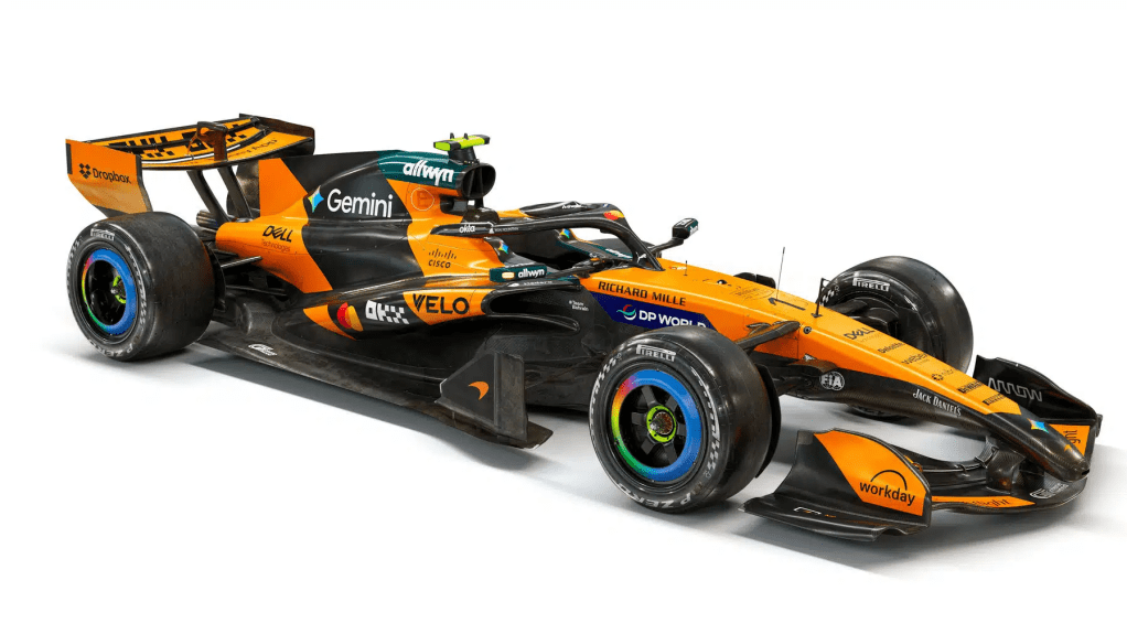
We start with… The world champions!!! Just what are they doing all the way down here?!
McLaren has opted for an evolutionary approach, rather than a revolutionary one, taking a leaf out of the (now defunct?) Red Bull School of Liveries.
At first glance, it feels like nothing has changed, aside from an increased MasterCard presence on the sidepods — given these guys are the team’s title sponsors, it feels like their presence shouldn’t be that subtle.
If there is anything else to note, is how the Google Chrome logo pattern on the wheels has become a wishywashy indistinctive gradient. I was not big on that from the very start, but between this and the original one? I have to say the previous version was better.
If the team manages to repeat or improve their 2025 results, though, having a somewhat disjointed livery won’t matter at all! 🙂
10. Aston Martin
AMR26
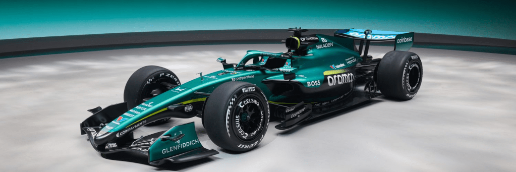
The worst of the new liveries, or best of the 2025 follow-ups? It may be hard to tell at first glance, but a few changes have been made, livery-wise, to the troublesome AMR26.
A while before testing started, there was some rumour that the whole team could, potentially, switch to a much lighter scheme for this year, reminiscent of Aston’s Vantages fielded in the World Endurance Championship around 2018-19, courtesy of a new link-up with Breitling.
Alas, some of us got too carried away… The British racing green lives on, for yet another season — not that it’s an issue for me, as the colour works really well with the car’s sculpted shape. There’s more bright neon accents all around, as well as a funky bright shade on the rear wing, which helps break up the “monotony”, so to speak.
Again, as is the case for McLaren, that’s not a real issue — except instead of winning the titles, Aston should first focus on finishing the races.
9. Alpine
A526
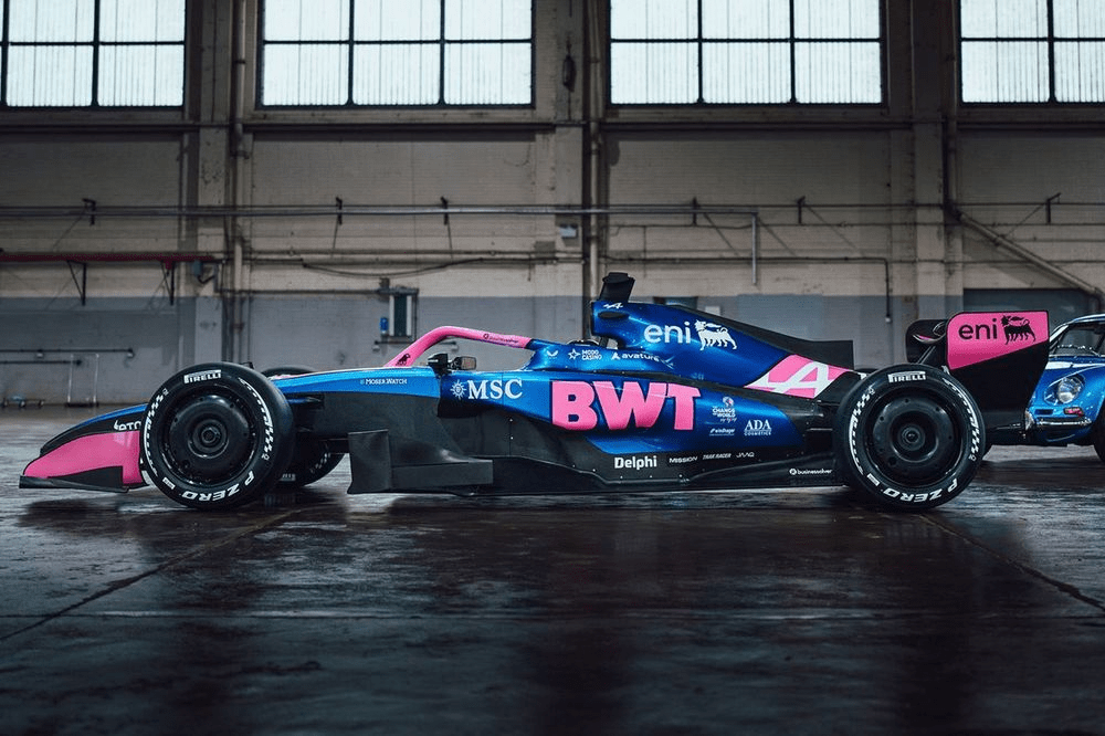
Evolution, not revolution: the theme continues as we move to the next team on my ranking, in the shape of the (now Mercedes-powered) Alpine.
Engine supplier changes — and all the associated political turmoil — aside, not a lot has been tweaked at Team Enstone. That would not be a huge issue, had there not apparently been an increase in the amount of bare carbon in certain areas of the car… or am I imagining things?
That said, we get to see the outfit’s attractive blue and pink scheme survive for another year, while evoking images in my mind of a rather popular brand of yogurt-flavoured candy over here in Brazil. The image shown above is slightly outdated, as pink accents have been introduced on the wheel covers — all for the better!
8. Cadillac
MAC-26
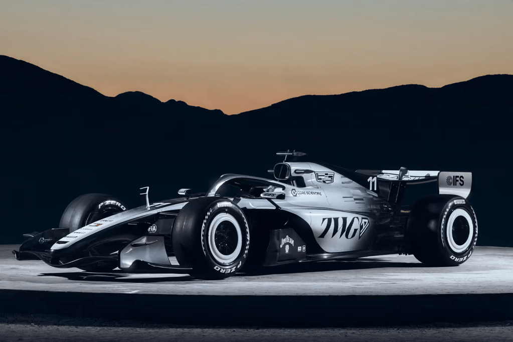
“It’s the West McLaren!”, an excited side of the Internet rejoiced, almost as soon as they laid eyes on Cadillac’s first ever Formula One challenger.
The detractors, on the other hand, were all too quick to dismiss it as another example of chronic blandness. “Where’s the yellow?! Where’s the colour?!” they asked, in outrage. Some even wished for a — rolls eyes — blue and white concept that had floated around news headers, upon the team’s approval as the 11th constructor.
For me, it is a bit of both.
It being asymmetrical is not a detriment by any means — I’m pretty sure there’s a lot of fondness for Toyota’s 2000s design, or even BAR’s 1999 zipper mishmash from hell. The problem for me is the lack of something to contrast with the predominant whites and greys and blacks, something that the West McLaren era had plenty of, with their red accents.
Thus, for me, it just feels unfinished… But a step in the right direction. The Cadillac name written in a script font carries plenty of elegance, as does the chequered logo pattern on the engine cover. The proverbial cherry on top are the classy white wheels, reminiscent of whitewall tyres. I did panic a bit as those were binned off during testing, but thankfully made a welcome return in Australia.
7. Williams
FW48
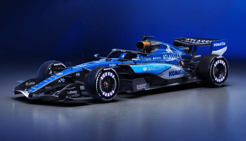
If there’s a team that can be excused for sticking with blue, it has to be Williams — even if for 2026 they’re switching to a lighter, soapy Atlassian blue. Gone are the gradients and (thankfully) the geometric elements, in favour of a much more sponsor-friendly design.
How friendly is too friendly, though? It certainly feels like something’s missing — something that screams “this is Williams!” instead of “rolling featureless advertisement!”
That said, I do like the quirky, roulette-style wheel design, as well as the Duracell airbox, a clever little element that never seems to grow old. The shades all work very well together, too — the soapy Atlassian blue, the lighter Barclays blue, and the white background for the Komatsu wordmark — even if the shapes are a bit too clunky.
At least it’s not the toothpaste-evoking design from 2020, when the team was at its clear worst, or the sponsor-devoid schemes between 2021 and 2023. If anything, the presence of big-banger names all over the car means we’re set to see the Williams name continue on into the future.
6. Mercedes
W17
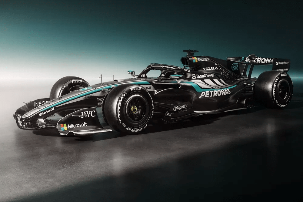
While I might’ve been disappointed at the lack of purple upon first sight — so much for bringing Nu onboard as a new sponsor! — Mercedes’s 2026 livery is quite a feast for the eyes… After you take a while to adjust to all the different elements, that is.
Like its predecessor, the W17 features a mix of silver, teal and black as its main colours, with the star pattern also making a welcome return at the rear of the car. More striking are the new AMG stripes running along either side, though the team’s newly-minted association with Adidas got some minds confused as to their real meaning.
That said, what is it with tech companies and logos sticking out like sore thumbs? This time, Microsoft is the culprit, with their colourful logo drawing all the attention on the airbox and front wing endplates.
Alright, maybe I am being too nitpicky…
5. Ferrari
SF-26
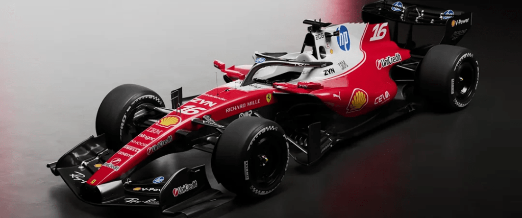
Opening my top five, and not ranked higher for reasons we can all correctly guess, Ferrari’s 2026 colours can only be described as a mishmash of retro Italianness.
While the tifosi — myself included, what is impartiality? — might cringe at all the recent memories triggered by cars with large portions of white on the livery, a return to a glossy finish alongside a brighter shade of red is welcomed with arms opened very wide. Props to Ferrari for also sticking huge driver numbers on the dorsal fin, as their distinctive font makes identifying who is who extremely easy.
Besides the very unsubtle blueness of the HP logo (the less said about it, the better), the other thing I would well and truly change would be the UniCredit logo sticking out. There needs to be a way to make it less tacked-on and messy.
The only way to make this better would be to go full retro a la 2025 Italian GP, with our favourite blue logo of all time giving way to HP’s newer, more minimalistic alternative one, using the very same shade of rosso corsa as the rest of the car.
That said… Have you renewed your monthly ink subscription?
4. Red Bull
RB22
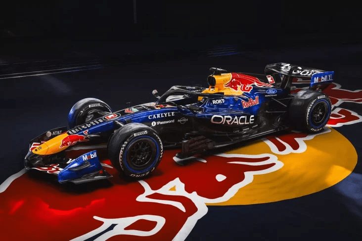
Out goes the matte — finally! — and back in comes the gloss. We rejoice!!! A change to the Red Bull’s colour scheme is enough to put it inside the top five.
Though it might be a bit disappointing for anyone who might’ve been expecting a rehash of Chloe Chambers’s bright Red Bull-Ford 2025 F1 Academy scheme — myself included — the RB22 is quite a feast for the eyes… under certain lighting conditions.
That’s right, don’t expect the new, two-tone blue pattern to stand out on cloudy days.
As a massive fan of all things retro, however, it’s nice to see a return of the white outline around the bull, company name, and driver numbers. This Ford partnership is working wonders for what we see on track… More on that in a minute.
3. Audi
R26
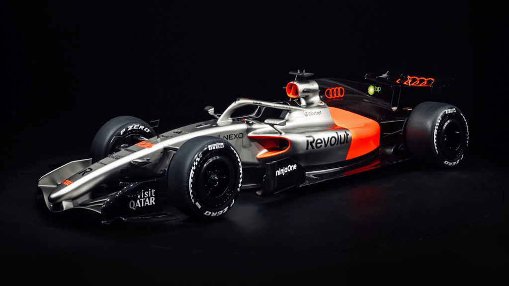
This might be where things get a tiny bit controversial…
Audi’s livery has divided opinions from the very start, after the initial concept was displayed to the public all the way back in November — as a minimalistic far cry from the German team’s striking 2022 announcement concept. I will admit, at first it was disappointing to see the exact same design be announced as the official 2026 livery, with the only change being all the sponsor logos added on.
However, after weeks of seeing it out in Catalunya and Sakhir, under varied lighting conditions, I must also admit it has grown massively on me. The front half of the car, with its titanium silver and all the sponsors in a harmonious black, adds a retro flair to the whole design, contrasting perfectly with the striking black and lava-like bit of red in the rear half.
My only real “complaint” regards the BP sunburst logo on the engine cover, as its greenishness does NOT go along with the rest of the livery at all. Given how small it is, however, it is not as bad as Ferrari with that gigantic HP monstrosity.
2. Haas
VF-26
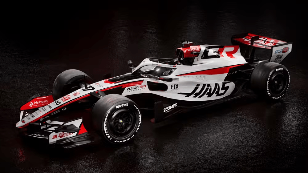
2019 notwithstanding (and that is a period of their brief history I’m certain they’d rather forget), 2026 brings a slight change to Haas’s colour palette, as the team’s technical collaboration with Toyota Gazoo Racing evolves into a title partnership. It doesn’t hurt that the TGR colour scheme had already been virtually identical to that of Haas in the first place!
While some might’ve preferred a callback to the distinctive, asymmetrical design Toyota fielded in the 2000s — justified, perhaps, as their revised Hypercar has gone full retro for this year (more of that in a future ranking) — I argue that this is perfectly fitting for the start of a new chapter in Haas’s decade-old history. Everything is very well-integrated, with nothing standing out as an eyesore. I am not exactly fond of black wheels, but in this particular case they provide a pretty solid balancing act.
Onto what (for me) is the best-looking car!
1. Racing Bulls
VCARB 03
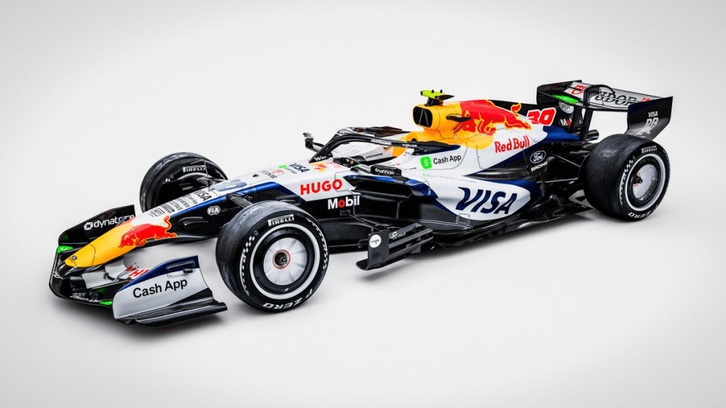
After stealing the show last year with a primarily white car, this year’s VCARB features some extra bits and streaks of dark blue, contrasting sharply with the Red Bull logo and mirroring their bigger sister in a way — bits of Ford influence showing?
Either way, there’s just something about how the elements go perfectly along with the shape of the car, taking advantage of the shorter dimensions adopted from this year (yes, even the chunky airbox). Sponsors are pretty well-integrated, even the flashier ones with their bits of green (looking at you, CashApp and Tudor), while the white wheels and wheel covers are the icing on the cake!
Okay, okay, don’t give me that look. That makes it two predominantly white liveries in the first two positions, yes. They’re up here for different reasons, however, and both are just as valid!
In a way, it is rather ironic that a team with an extremely convoluted and tediously corporate-sounding name has managed to whip out amazing liveries for three seasons in a row… I can’t wait to see their specials.
Is there anything you’d change about this ranking? Let us know how pissed off you are in the comments!
Expect more content around here in a while! 😉

Leave a comment